
Ryan Snarr
Creative Lead
The Best Type of Summer
So, you’re looking for a nice ‘summertime’ typeface…
How do you choose when there are so many to choose from? One way I like to think of this scenario is in terms of a job that needs to be done. Which typeface should I ‘hire’ that will do the job right? The late Clayton Christensen did some groundbreaking work on this idea of ‘jobs to be done’ as a professor at Harvard University. Christensen says, ‘We hire products to do things for us.’ This also helps us understand why there are so many fonts out there. There are so many different jobs to be done when we’re communicating with the written word. An effective font selection is one where the characteristics of the font align with the purpose of the text and the message to be communicated.
Consider also this idea shared by designer Chris Do: The more you know about the purpose and the history of the typeface you’re using, the more likely you can make an informed decision about how to use it. This is akin to reading the resume of a typeface before hiring it for a task. It’s an extra step, but worth it if you can gain access to the information.
“An effective font selection is one where the characteristics of the font align with the purpose of the text and the message to be communicated”
So how does a font convey a real summertime vibe? Thinking how an audience relates to summer will help answer that question. Think of the five senses: What does summer feel like, look like, taste like, sound like, and smell like? See the example brainstorm below:
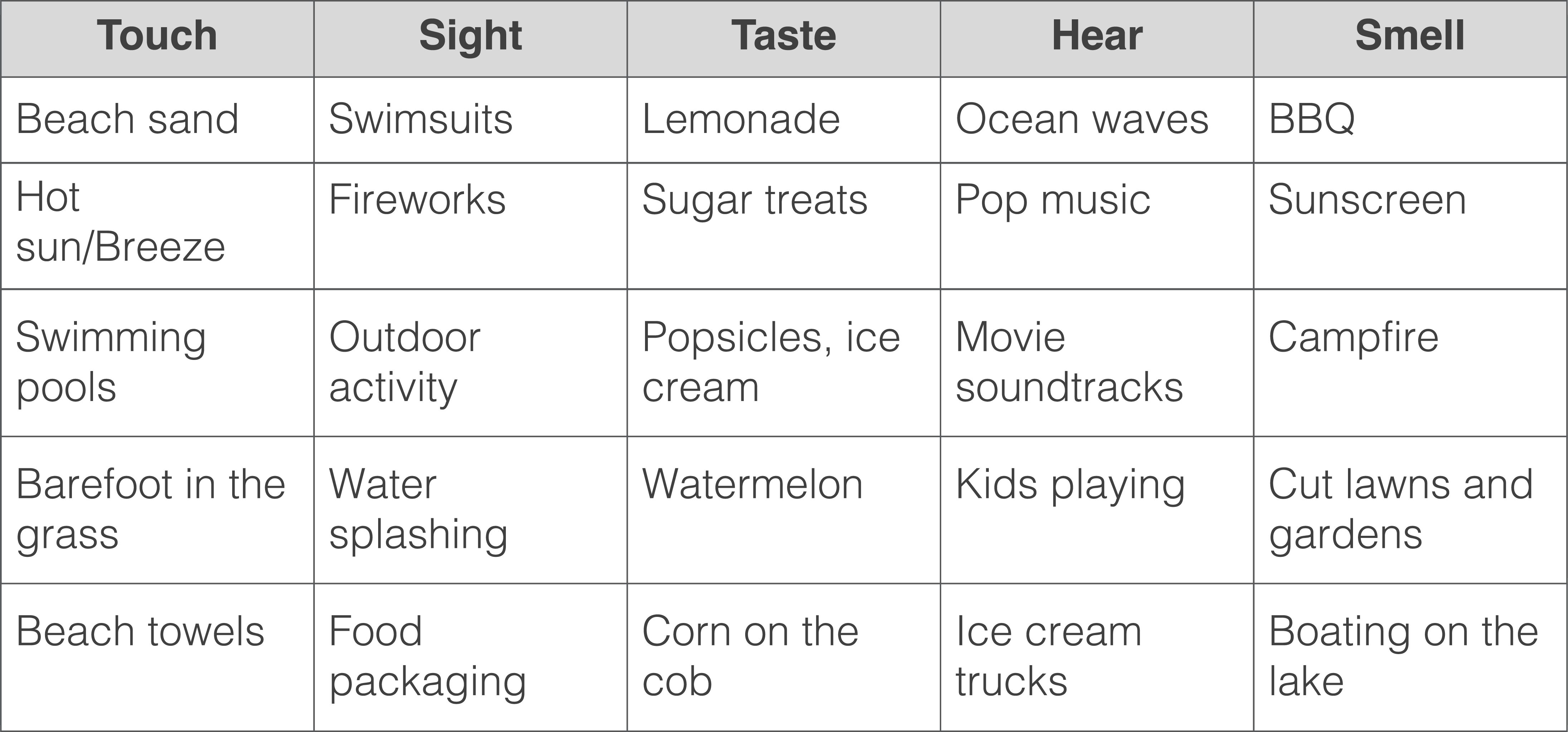
With this list of brainstormed items, selecting type that hints at, or compliments, any of these items is the way to go. Once again, going back to determining the job your text needs to do for you, decide how loudly you want your font to shout summertime. Determine if it needs to play nicely with other fonts; if it can hog the spotlight or need to pull back a little bit. The summer attributes for your type might be so subtle and yet supported by surrounding color and design elements. You don’t need to make them work on their own.
Here are some fonts sourced from myfonts.com that seem to fit the season:
Anjika Jaya – Love the handwritten flow and the organic edge. Reminds me of a note that says meet me at the beach, or a statement in my high school yearbook. #HAGS

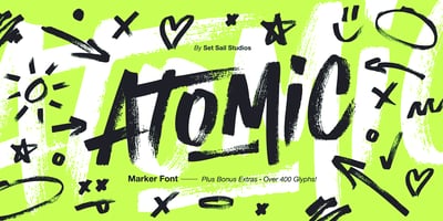
Atomic Marker – The flow is energetic and bold. Reminds you of hand-written yard sale posters, or a battle of the bands invitation, but way better.
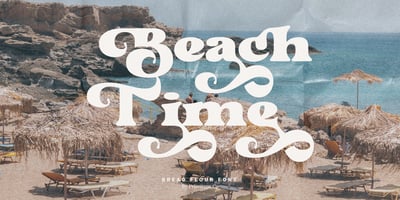
Bread Flour – This font hints at ocean waves and reminds me of some signage to your community wave pool.
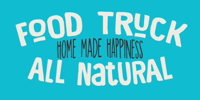
Food Truck – Nothing says summertime like hitting the food trucks that roll up to the festival, the farmer’s market, or the grand opening.
Matolha – This bold font has flowy waves and summer breeze baked into it.
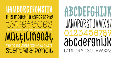
PH Font – This is a playful font that hints at innocent handwriting while avoiding the kitch of Comic Sans. Perfect for a lemonade stand.
Retro Monkey – I smell suntan lotion when I see this font. SPF 30.
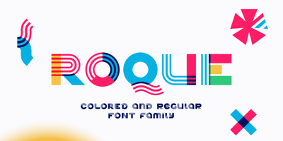
Roque – This font hints at summer fashions I remember as a kid as well as some water waves and nautical flags.
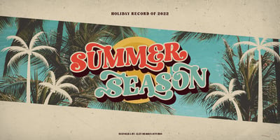
Summer of 76 – The text sure has a late seventies vibe, and it really has some similarities to the text created for the 1968 summer Olympics in Mexico. Either way, it’s a summertime win.

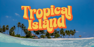
Tropicon – This text has the ripple effect of a pool’s water surface built into the letter forms.
Selecting a display font for your message is like choosing a main course. Pairing your font with something complimentary can be like adding a special sauce or seasoning. Contrast and visual tension between a primary and supporting fonts is important.
Adobe Experience Designer and typography expert, Jake Giltsoff, says that good design is going to have an anchor font; one that conveys the right emotion for the design. An anchor font will do the heavy lifting in grabbing attention and communicating important information out of the gate. Avoid pairing fonts where each command a spotlight. This can distract from your intended design and message. Fontsinuse.com is a helpful resource to see how other designers are combining fonts to effectively communicate their message.
For me a great summer pairing is hot summer temperatures and cold popsicles. They go well together, but they couldn’t be more opposite. Combined, they evoke a specific kind of feeling and memory. A good font pair will do the same almost unconsciously. Here’s to having the type of summer to write about!
