
Rachel Klein
Art Director
Audience Missing the Message Because There’s Too Much Message? Minimalism in Design
I enjoy art and design in all its forms. Good design is so diverse and dynamic, it really does not have any rules. But if I could make a rule, or even just a case for minimalism, I believe it is central to effective design and viewer/user experience.
While I’m sure many are bored with stark Scandinavian interiors and nonplussed by the squares of Mondrian, incorporating minimalism into your design thinking will lead to more streamlined message. One that your audience is going to comprehend quickly and easily recall.
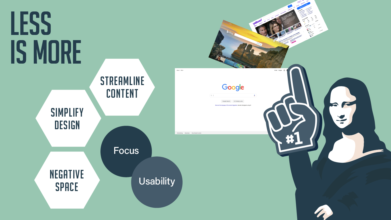
Minimalism really took off post-World War II at the height of the modern art movement, and is still used to benchmark what is considered “modern” today. While minimalism is not the most exciting or flashy aesthetic, the principles of minimalism have had widespread influence on visual design across the board. When applied to graphic design the primary considerations are wide open negative space, streamlined content and functional visuals. Leaving off decorative elements and superfluous content that distracts from the message and frustrates the audience. The internet is a hectic and loud place with a lot competing for your attention, so when you land on a website that has an uncluttered and simple to navigate interface, you’re more likely to spend time on it. It is always tempting to utilize every precious inch above the fold, but does that actually pull your viewer in? Or does it send them clicking away from the noise without even bothering to skim over the excessive information?

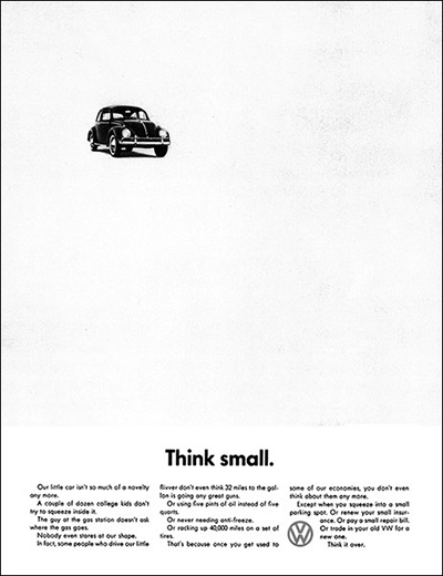
Famous 1959 VW ad by Helmut Krone changed the advertising game. The Think Small campaign was sincere and relatable during a time when ads were typically full color fantasies.

Jason’s Take
Marketers and designers, please take this to heart. Negative space is the opportunity for your customers to fill in their own mental blanks. I love the psychology of it all, and your marketing message will resonate emotionally if the viewer can easily digest your message. I know, I know, your services are packed with so many amazing features and benefits. But the more you pack in, the more you’re monologuing instead of dialoguing. I really like Rachel’s perspective on this, and she applies the power of “negative space” to a variety of solutions, both on and off printed canvas.
