

Ryan Snarr
Creative Lead
Moving Others with Motion
We’re always looking for ways to implement interactivity and movement into things that we design. A good example of this is the latest edition of our promotional notepad. Who doesn’t love a flipbook? A simple pad of paper becomes memorable when people engage with it by flipping through its pages.
Quick question: When you interact with a flipbook, do you flip the pages upward towards your face or do you flip them downward away from you? You’d be surprised at how passionate some can be on this topic.
In this case, our flipbook depicts an illustration that animates to show the ‘T’ in Targa’s logo coming together. This idea is so simple and it has been around for ages. Honestly, who doesn’t remember drawing their own stick figures in their textbook, encyclopedia or pad of sticky notes just to try their own hand at basic animation? This nostalgic factor can be the glue in your sticky marketing.
Of course ‘sticky marketing’ is just a phrase until you can assign some actual marketing numbers to it. An A/B test done by VistaCreate demonstrated the objective, real life number results below:
“As you can see, our animated ad attracted 1.5x more clicks than the static image. This made our cost per click drop 50%. And despite our animated ad reaching notably less users – 18 thousand for video vs 25 thousand for the static ad, the number of clicks on our advertised link was more than double for the animated ad – 325 clicks vs 145 clicks.”
There are many different levels of motion that can be incorporated into marketing. From full fledged video and animations to small gif files. Targa’s signature signature images are an example of really simple graphics that catch the eye with movement.


If there is something I like as much as a motion graphic, it’s a nice list. Here’s 10 reasons to consider putting your next idea into motion.
1. Chop through the clutter:
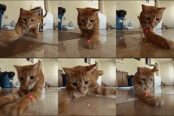
Like a sneaky ninja, motion grabs attention faster than a cat chasing a laser pointer.
2. Java Jolt:
Who needs coffee when you have motion graphics to wake up the eyeballs?

3. Storytelling Sorcery:
Disarm your audience with moving narratives that would even make Harry Potter go, “Expelliarmus!”
4. Fisherman’s lure:
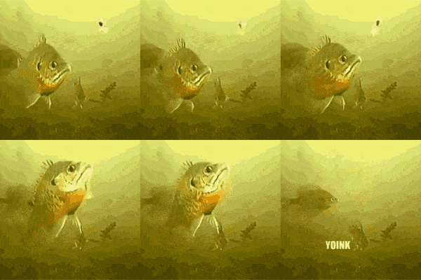
Move it or lose it—motion keeps your audience hooked like a fish on a reel.
5. ‘Digital’ Engagement:
Get those thumbs tapping and hearts racing with animations that scream, “Like me!”

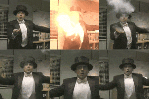
6. Visual Voodoo:
Turn mundane into magic with motion—still can be stale when you only have a split second to make an impression.
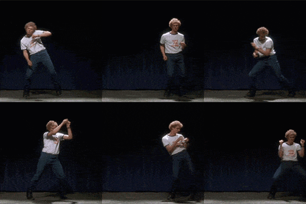
7. Brand Boogie:
Show off your brand’s dance moves and make competitors feel like wallflowers.
8. Memerable Marks:
Leave a lasting impression like a lipstick stain on a white shirt—intentional, of course.

9. X Marks the Spot with Motion:
Make users feel like they stumbled upon buried treasure—click, explore, repeat!

10. Roll out the Runway:
Give the red carpet treatment to your ideas and let them strut their stuff in motion!

