


Sara Tranberg
Art Director
Visual Hierarchy: How Good Design Guides the Eye
Getting into the nitty-gritty of visual hierarchy is a daily occurrence here at Targa. Why? Because without it, design can become decoration, or worse, a distraction instead of effective visual communication.
The assets we create for our clients shouldn’t just look beautiful. They need to communicate a clear message, make information easier to understand, and support a real business goal. Eye-catching is nice. Eye-catching and useful is much better.
What Is Visual Hierarchy?
Visual hierarchy is the order in which people notice and understand the elements in a design.
As designers, we wield a surprising amount of power. The way we structure a layout can guide the audience toward what they should notice first, what they should read next, and, ideally, what they should do when they reach the end.
We create that path using principles such as scale, contrast, typography, placement, proximity, and negative space. But before making any of those decisions, we have to answer a more important question: What does the audience need to understand first?
Design is not a democracy where every headline, button, caption, and decorative squiggle gets equal time at the microphone. Something has to lead.
Why Visual Hierarchy Matters
You’ve probably heard the claim that humans now have a shorter attention span than a goldfish. That statistic doesn’t hold up particularly well, but anyone who has scrolled through a website, glanced at an ad, or opened a crowded presentation knows that people make quick decisions about what deserves their attention.
Is this relevant to me? What is the point? Where should I look? What am I supposed to do next?
People often scan headings, subheads, lists, and visually distinctive elements before deciding whether to read more closely. Good hierarchy makes that scan useful. It allows someone to understand the basic message even if they don’t read every word.
If a design is confusing or overwhelming, we’re asking the audience to do too much work. Visual hierarchy sends the eye to the most important content first, then creates a logical path through the supporting information.
Sometimes the goal is to create a design the audience barely notices. If someone understands the message quickly and efficiently without thinking about the layout, that can be a job well done.
At Targa, we like to go one step further. Once the hierarchy is working, we look for opportunities to add a little delight. Clear communication comes first. The personality, surprise, and brand-specific details are what make that communication memorable.
How to Create a Solid Visual Hierarchy
1. Start With the Why
The process begins before anyone chooses a font, color, image, or layout.
We start by asking questions:
- What is the goal behind this asset or campaign?
- What action should someone take after seeing it?
- Where will the design appear?
- Who is the audience, and how does this add value for them?
- If the viewer remembers only one thing, what should it be?
Those answers shape the layout. A trade-show banner viewed from 30 feet away should not be structured like a product sheet someone will read at a desk. An email, presentation, landing page, social post, and printed brochure may contain similar information, but each requires a different visual path.
Once the goal is clear, rank the content from most important to least important. That ranking becomes the foundation of the layout. It also helps prevent the late-stage request to “just make everything pop,” which, unfortunately, is not how popping works
Next, explore layouts that support the hierarchy you’ve established.
Hand sketches or rough wireframes in your design program of choice are ideal. We love Figma, but the tool matters less than the thinking. At this stage, the goal is not to make anything beautiful. It is to decide where the eye should land and how it should move.
This step is easy to skip when a deadline is tight, but a few quick sketches can prevent hours of endless tweaking later. Without that early thinking, it is surprisingly easy to spend an afternoon moving the same four boxes around an artboard, waiting for one of them to reveal the answer.

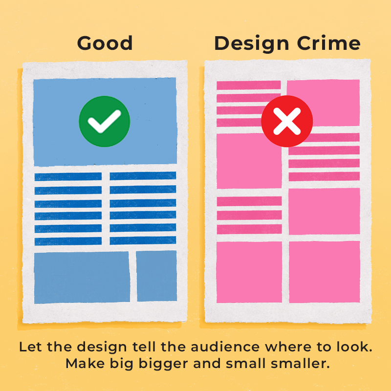
Wireframes can also expose the dreaded checkerboard layout: a collection of equally sized boxes, images, and headlines that all carry the same visual weight. Everything is technically organized, but nothing leads. When every element asks for equal attention, the eye doesn’t know where to begin.
3. Create Clear Levels of Importance
Once the structure is in place, use a few basic tools to make the intended path obvious.
Scale and Typography
One of my favorite visual hierarchy phrases is, “Make big bigger and small smaller.”
If two pieces of information have different levels of importance, a tiny difference in size may not be enough. Create a clear relationship between the headline, supporting message, body copy, captions, and secondary information.
Contrast
Contrast can come from size, color, shape, weight, texture, or placement. A bright button against a quiet background will stand out. So will a bold headline surrounded by lighter text.
But contrast only works when it is selective. If everything is bold, colorful, oversized, or sitting inside its own shape, the entire design is just yelling.
For digital work, contrast also needs to support accessibility. A headline may technically be large, but if its color is too close to the background, it can still be difficult to read. Looking sophisticated is not especially useful if the audience has to squint.
Proximity and Negative Space
The brain perceives elements placed close together as related. Space between elements suggests they belong to different groups.
That makes negative space an active design tool, not leftover room that needs to be filled. It can connect a headline to the paragraph it introduces, separate one idea from the next, or give an important message enough breathing room to command attention.
White space is not wasted space. Let the design breathe.

4. Practice Subtractive Design
Once the content is in place, start removing.
Are two sections saying essentially the same thing? Is a decorative element competing with the message? Could anything be removed without changing what the audience needs to understand?
Sometimes the simple design that makes someone say, “Oh, I could design that,” is the one a designer spent the most time refining.
You may know the acronym KISS: “Keep it simple, stupid.” I’m not sure why we need to insult ourselves at the end, but the point is useful. Clarity comes from making deliberate choices, not adding more things. The delete key is a design tool too.
Are two sections saying essentially the same thing? Is a decorative element competing with the message? Could anything be removed without changing what the audience needs to understand?
Sometimes the simple design that makes someone say, “Oh, I could design that,” is the one a designer spent the most time refining.
You may know the acronym KISS: “Keep it simple, stupid.” I’m not sure why we need to insult ourselves at the end, but the point is useful. Clarity comes from making deliberate choices, not adding more things. The delete key is a design tool too.
5. Test the Path
Before calling the design finished, step back and see whether the hierarchy works as intended.
Try the squint test. Blur your eyes or zoom far out until you can no longer read the words. Which elements still stand out? Do they match the intended order of importance?
You can also show the design to someone who hasn’t been involved in the project and ask:
- What did you notice first?
- What do you think this is about?
- Where would you look next?
- What action do you think you’re supposed to take?
Finally, test the design at its actual size and in its intended environment. A layout that works beautifully on a large monitor may fall apart on a phone. A presentation slide may look balanced up close but become unreadable from the back of a room.
Clear First. Delight Second.
Visual hierarchy isn’t about making a headline enormous and calling it done. It begins with understanding the goal, prioritizing the content, and making deliberate choices about how someone should receive the message.
When the hierarchy is working, the design feels natural. The viewer knows where to begin, understands how the information fits together, and can find the next step without fighting through visual clutter.
Once that foundation is solid, there is room for the part we really love: adding personality, surprise, and those little moments of delight that make the work feel unmistakably connected to the brand.
Clear first. Delight second. When the two work together, design stops being decoration and starts doing its job.
And, if we’re lucky, nobody asks us to make the logo bigger.
Would we be a good fit?
We pride ourselves in communicating your message with a clear visual heirarchy. If we’re a good fit, we’ll help you with your design and marketing. We’re an extra set of hands, showing up when it’s all hands on deck. Let’s connect and find out →